Painting with Gouache
I bought some Gouache paints yesterday, on the advice of a friend because I must admit, I do find using watercolour paints a little difficult. Gouache paints give you more of an opaque quality to your artwork, as you have more of a choice with painting over existing colours already laid down, thus eradicating mistakes. I find watercolour limits you in this regard, and I have made plenty of mistakes!
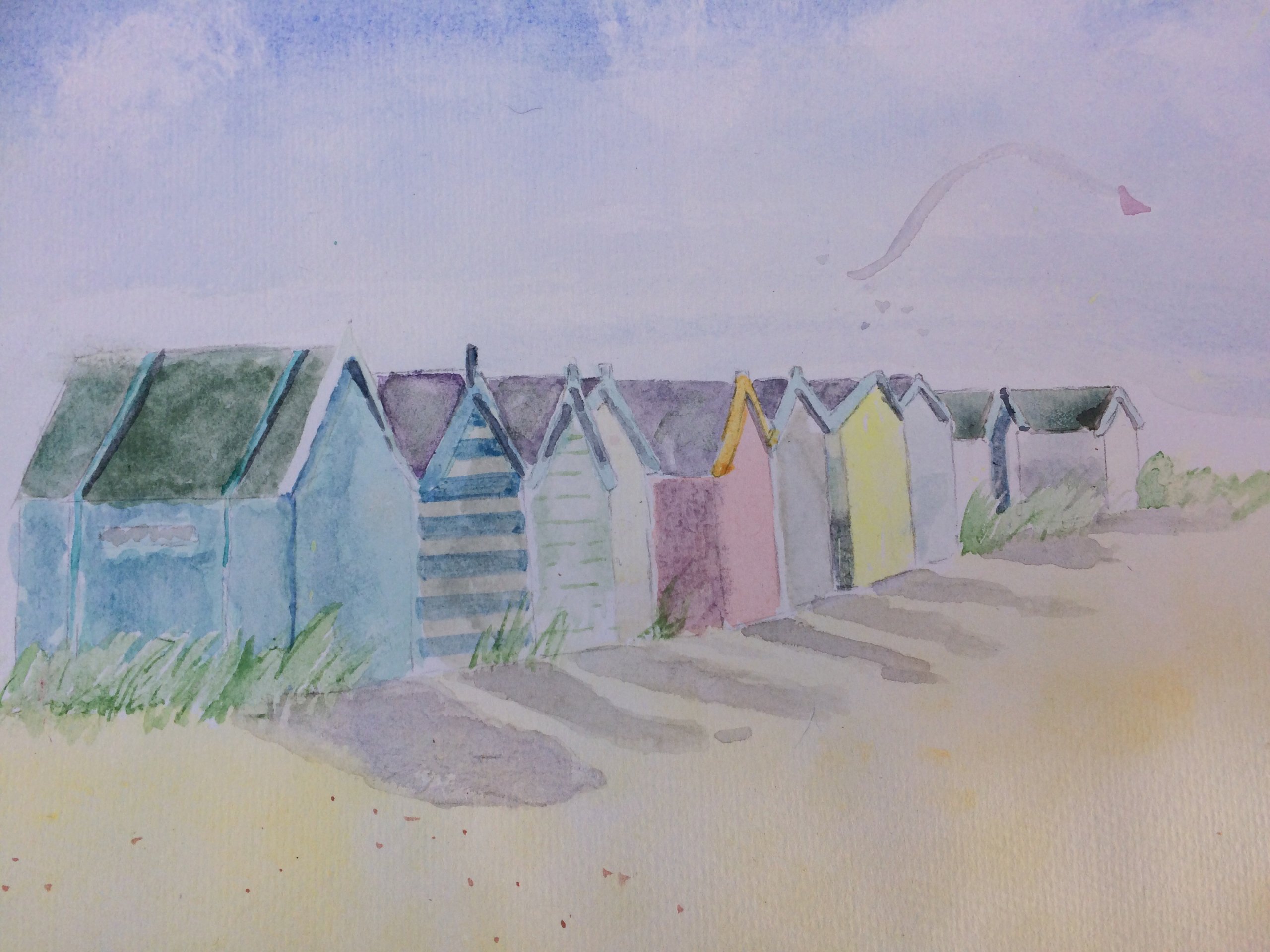
I worked on a painting this afternoon using this new medium and was pleasantly surprised. I found it much easier to use. I took some photographs of my painting in progression to show you the process that I used.

Figure 1. I used an HB pencil to make a simple drawing, then added a strong wash of Ultramarine blue for the sky. I then used a piece of kitchen paper to lift out the colour for the clouds. Next, I painted a pale wash of lemon yellow all over the buildings.
Figure 2. The next stage was adding some pale raw sienna for the rooftops, a stronger lemon yellow for the shadows on the edges of the taller buildings at the back, and a pale wash of raw umber and ultramarine blue for the darker shadows on the building fronts.

Figure 3. To create more shadows, I continued with the burnt umber and an ultramarine wash, lightly at first by adding water, and adding more paint to make the shadows darker. Raw sienna was added to the lemon yellow to make the orange colour deeper for the sides of the building in the forefront and the rooftops.

(I’d just like to add that at this mid-way point, I do tend to give up, as for me, a painting never looks right. But I persisted 🙂
Figure 4. Now I needed to concentrate on the windows, (windows do send me into a cold sweat! See my post, ‘The Pain of a Pane’). I mixed some more ultramarine with a little white, and added the panes of glass; going over these with the shadow mix diluted with a bit of white again.

I didn’t want this too be too dark as I intended to finish with pen and ink. I then used a pale wash of sap green and a sponge for the bushes with a darker wash of this colour over the top when the first was dry. A few dabs of deep red came next for the suggestion of flowers.
Figure 5. While the paint was still damp, I used a fine tipped black pen (this creates a smudging effect), and added some lines around the buildings and rooftops. I think it’s brought the painting all together. I am quite happy with the result and I will definitely use gouache again; it was great to work with x

Colours used: Ultramarine blue, burnt sienna, raw umber, lemon yellow, white, sap green and deep red.
X Pip